La tartaletera (The Tartlet)
Work realized with Nelson Hernández

Before beginning
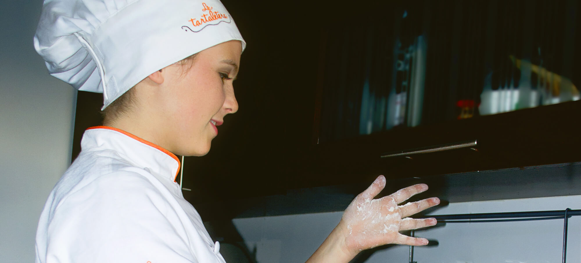
La tartaletera is a bakery specialized in tartlets and quiche, which are made based in two ways: The first one: the classic; where are used basic ingredients and traditional combinations. The second one: the innovative: where the innovation of the products are mix with the colombian gastronomy
Brief
Create a modern brand identity, where is evident the philosophy of natural and traditional.
Concept Process

Values
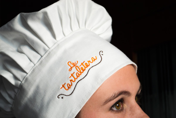
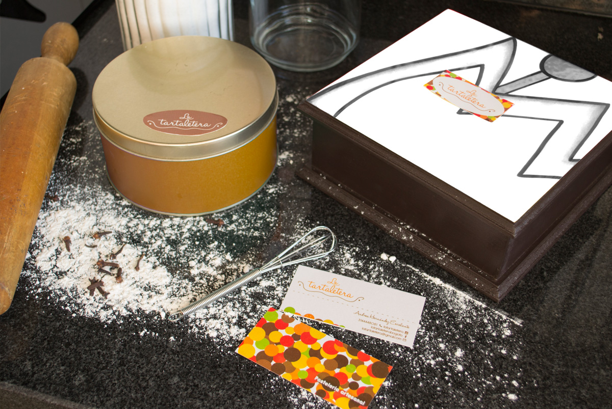
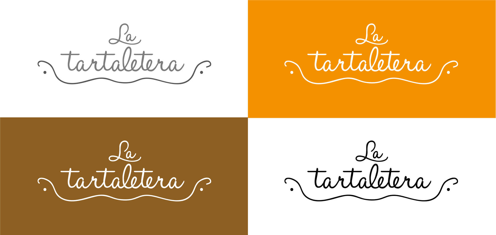
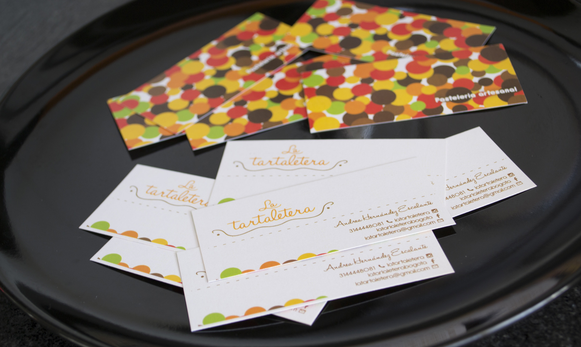
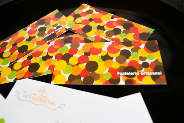
Craft, been the most important value, due that the product are 100% handmade by the owner with organic and natural raw materials, is represented with the brown color, the typography and the tartlet handmade symbol that contains the name of the company and Modern , and happiness for the work of the baker is represented with the orange color and the pattern of dynamic circles of the complementary graphic, as a methaform of a game of endless possibilities, as well reinforce the fact that if their portfolio exist a wide diversity of products.

C: 4% M: 50% Y: 99% K: 0%
R: 236 G: 144 B: 1
#:ED9101

C: 32% M: 47% Y: 77% K: 29%
R: 147 G: 112 B: 61
#:93703D
